
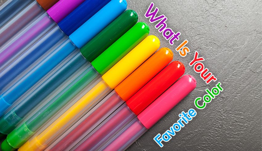
A favorite color can depend on where you use it
“What’s my favorite color?” can have several answers. You might love a purple phone case but prefer white bedroom walls. A color you enjoy wearing might be different from the one you choose for a movie poster.
This quiz suggests a color for fun; it can’t determine your true favorite. You get to decide how well the suggestion fits, and you don’t need to choose one color for everything.
How your choices guide the suggestion
The 15 questions ask about visual preferences in everyday settings. You choose what you’d want on a notebook cover, behind your phone’s app icons or on the walls of a small bedroom. Other questions ask about outfit accents and the look of a movie.
Your answers guide a suggestion from seven possible colors. These choices give you a way to think about what catches your eye. They don’t tell you what kind of person you are.
Pick the answer you’d actually want to look at or use. If two options appeal to you, choose the one that fits the situation in the question. A mug you see every morning doesn’t have to match your profile photo.
What the seven color suggestions mean
The results name colors to explore. Each color has different shades, so you can like one version and dislike another. Use these palette ideas to compare the suggestion with your own taste.
Blue
Blue includes pale sky blue and dark navy. If you get “Your Color Suggestion Is Blue,” try comparing those two shades. Pair either with white to see how much contrast you enjoy.
Green
Sage and lime look quite different, even though both are green. “Green Suits Your Picks” gives you a starting point to explore that range. A green notebook beside a cream-colored mug is one simple pairing.
Purple
For “Try Purple,” compare light lavender with a darker plum shade. You could test purple as a small accent against gray before choosing it for a larger surface.
Red
A red detail can draw your eye against a white or black background. With “Red Catches Your Eye,” consider how much red you want: a phone case and a whole wall are different choices.
Orange
Peach is a softer option than bright orange. “Orange Is Worth a Try” leaves room for either. Compare orange with cream or blue in a picture before deciding which pairing you prefer.
White
“White Fits Your Visual Preferences” could be a reason to try a simple background for colorful details. Compare white with cream, then add one accent you enjoy. Notice which background you prefer.
Black
Black can fill a background or outline a small detail. For “Consider Black,” try pairing it with gray or a color you already like. If you’re choosing an accessory, the braces color quiz is another way to think about colors you’ll wear.
Leave a Reply